|
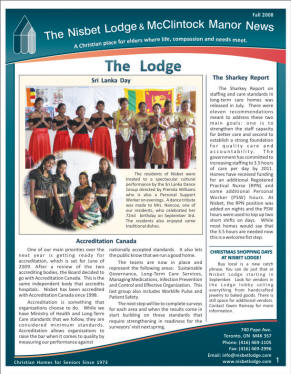
Nisbet Lodge & McClintock Manor News
- Spring, Fall, & Christmas newsletters
each year since 2002
This
newsletter evolved over 6 years from a
two-colour (black & Nisbet's pantone blue) to a full
colour glossy newsletter.
In 2002 I first developed a two-colour conservative
design in keeping with the nature & budget of the
Christian focus of this organization which provides "A
Christian place for elders..." offering both senior
residences and long-term care facilities. Using all the
tonal values of the spot blue (from 10% to 100%) I
achieved a broader range and richness of "colour"
In 2006 I redesigned the newsletter, keeping within the
client's budget with 2 colours. As in all my
projects, I created several layout styles for the client
to choose from. Nisbet chose a softer flowing design
reminiscent of pages in a book of scriptures.
Commercial printing processes continually advance &
improved & colour printing has lowered in price.
When I redesigned the newsletter in full colour, I used
Nisbet's corporate blue in a gradated fill for colour
vibrancy and added discreet touches of contrasting warm
orange/red.
Challenges in this project involved incorporating and
separating large amounts of text to allow easy and
orderly viewing/reading. The changing nature, quantity
and quality of the client's photos required original and
inventive solutions. |